Graphic design
- 2018
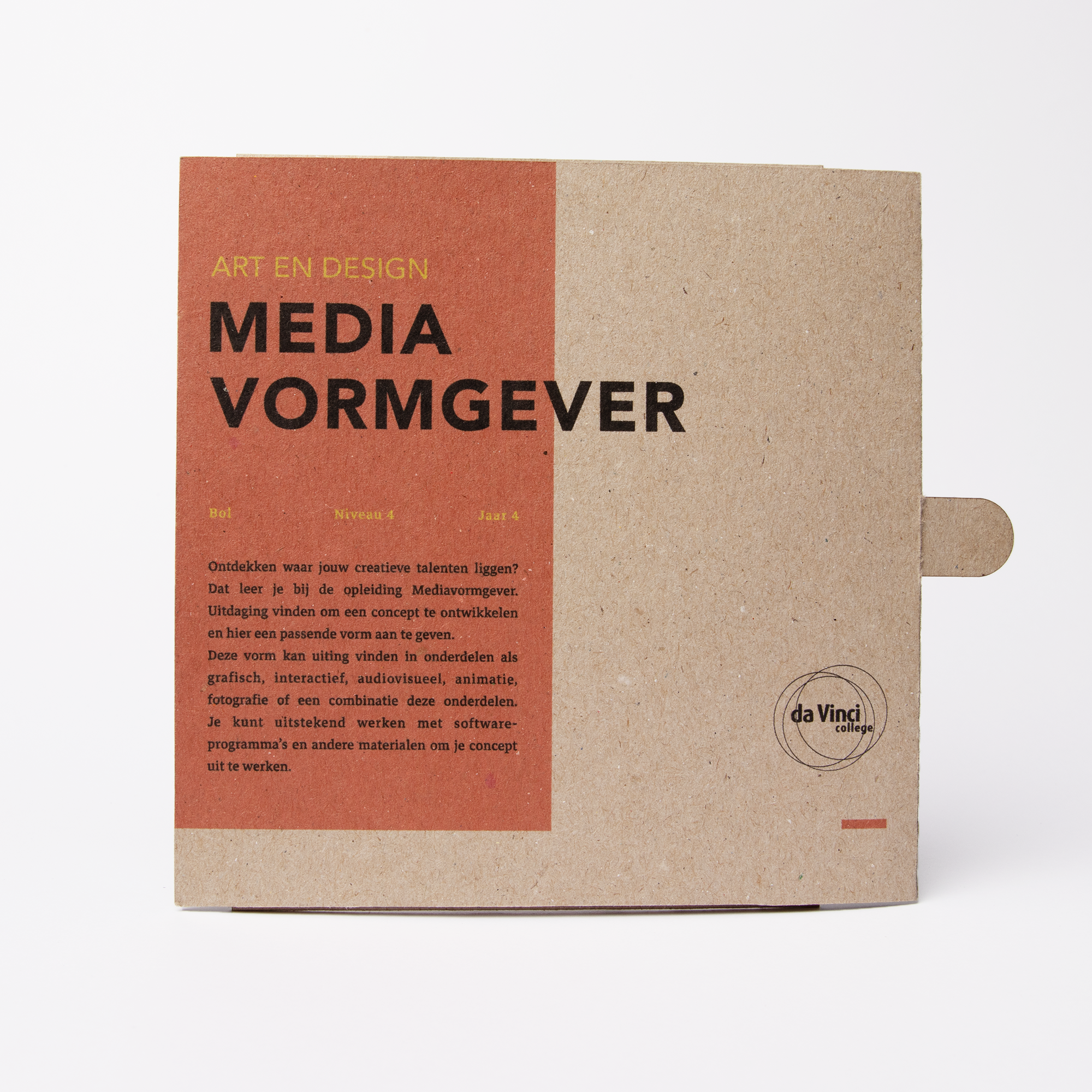
MEDIA-DESIGNER CARD
Brief
Make a promoproduct for an open day of the DaVinci College
to present the study ‘Mediavormgever’. The product
is presented in the classroom on the ground floor.
Concept
In this concept I used resonance, using sound waves to form a graphic image. An abstract geometric image is formed by vibrations of the word ‘media designer’. The resulting patterns are processed into a 2D moire motion image. A moving image is created using a moving mask. This presents the study media designer, by presenting graphic design, spatial design and audio visual in a graphic card.
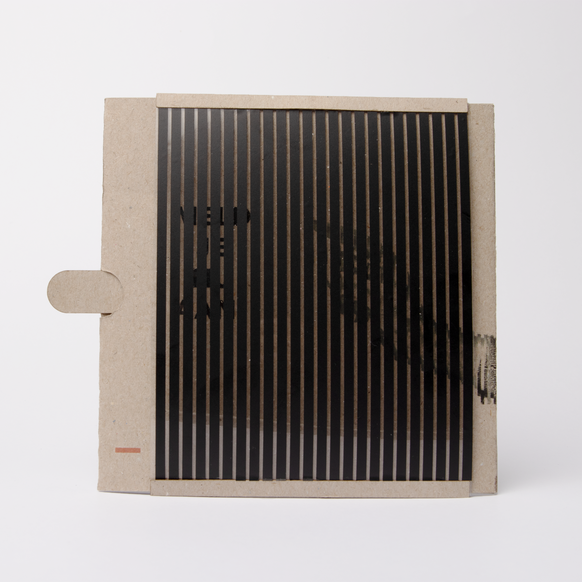
Final product
01
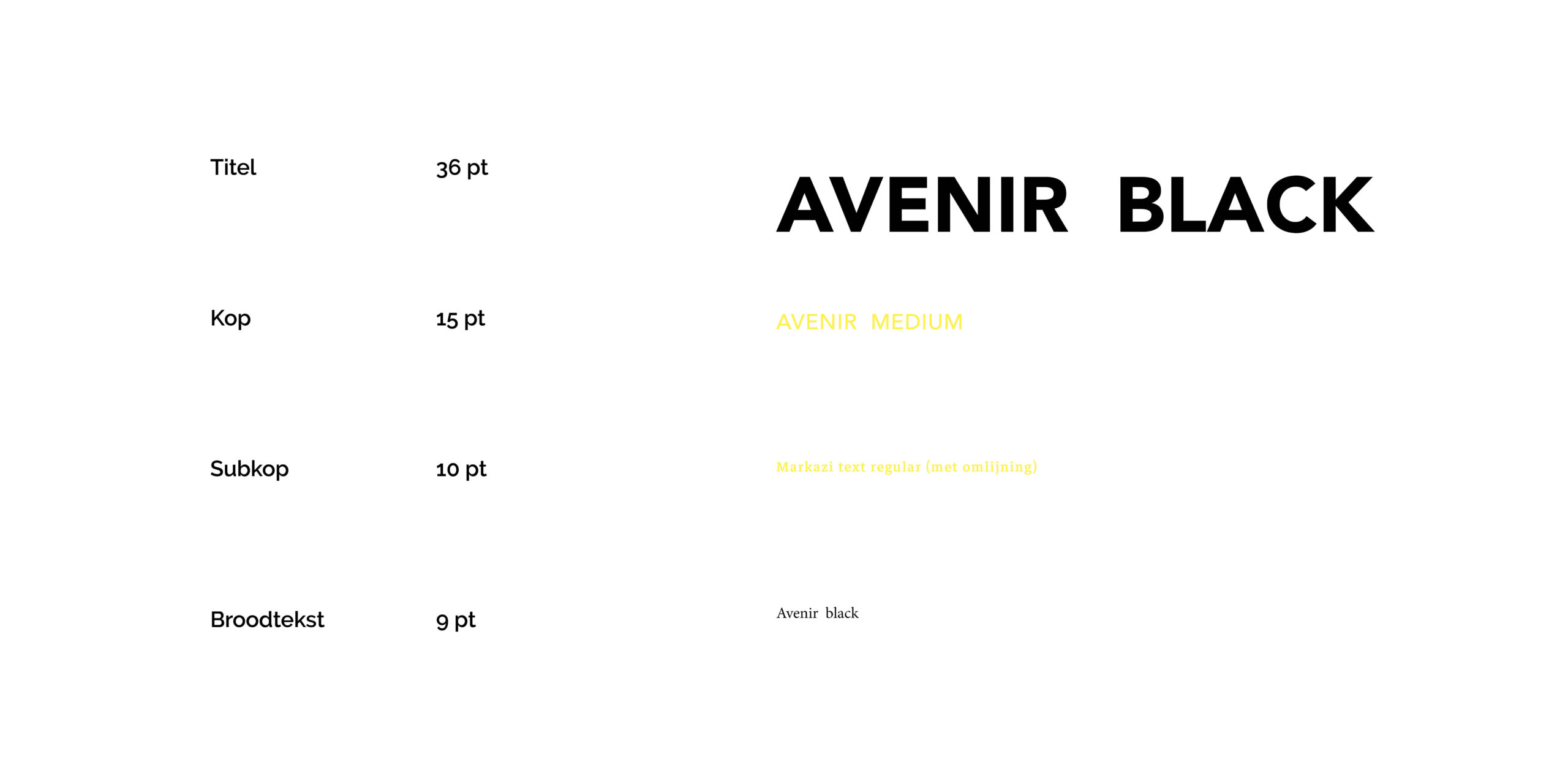
For the study media designer, I designed a new brand identity. For the title I choose a sans serif font because this symbolizes trust, as well as a modern and technical focus. To bring contrast I used a serif font for the subtitle and breadtext. The contrast symbolizes the diversity of design and people in DaVinci College.
02
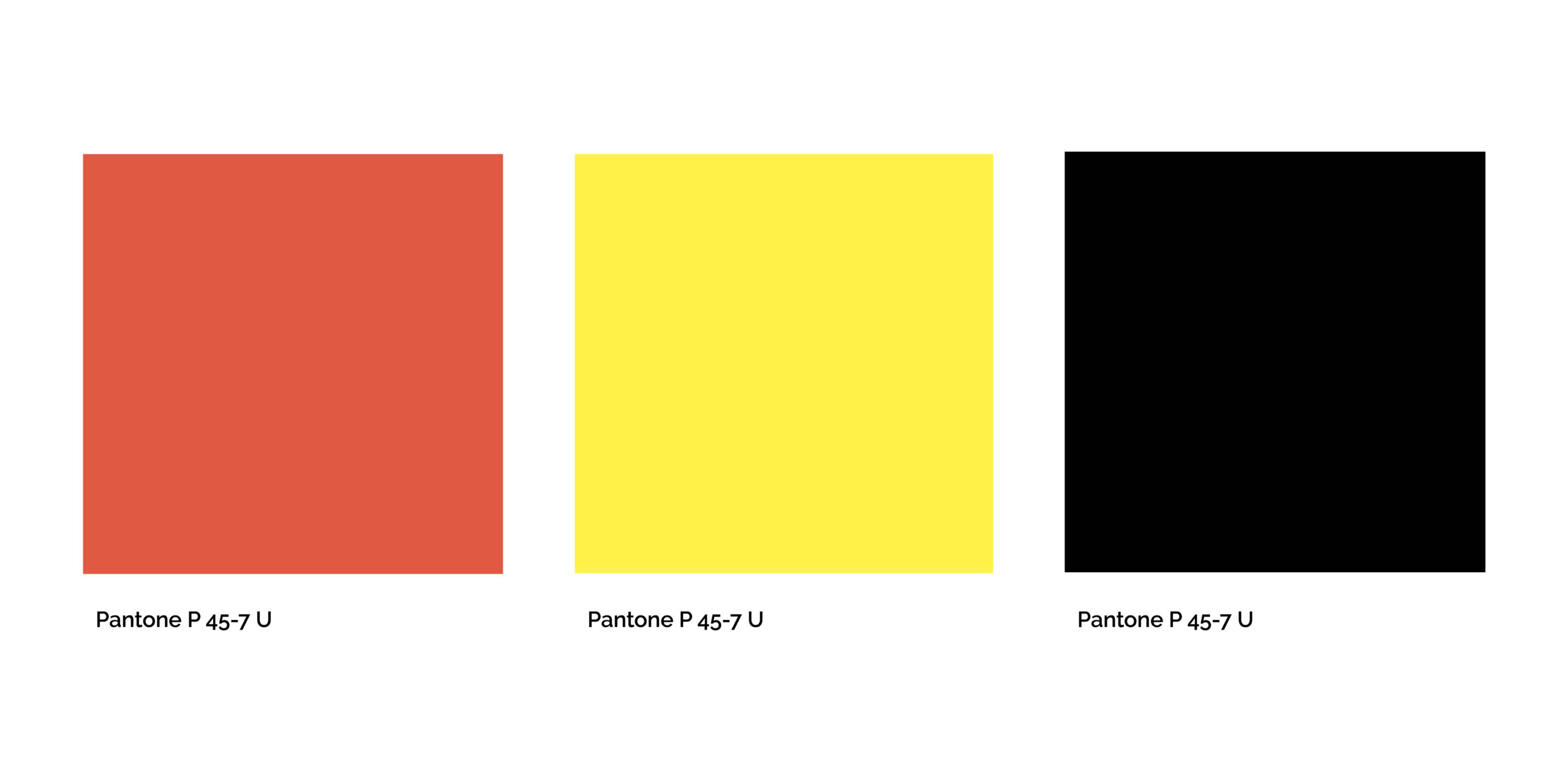
As colors I choose the following:
Orange: This represents the warmth of the school and
its individual care for the students. Yellow: represents fun, optimism, and friendship. This is exactly what you can expect to find in the study. Again, to present the contrast we used. As a contrast, we used black. This symbolizes strong concepts as professionality and power.
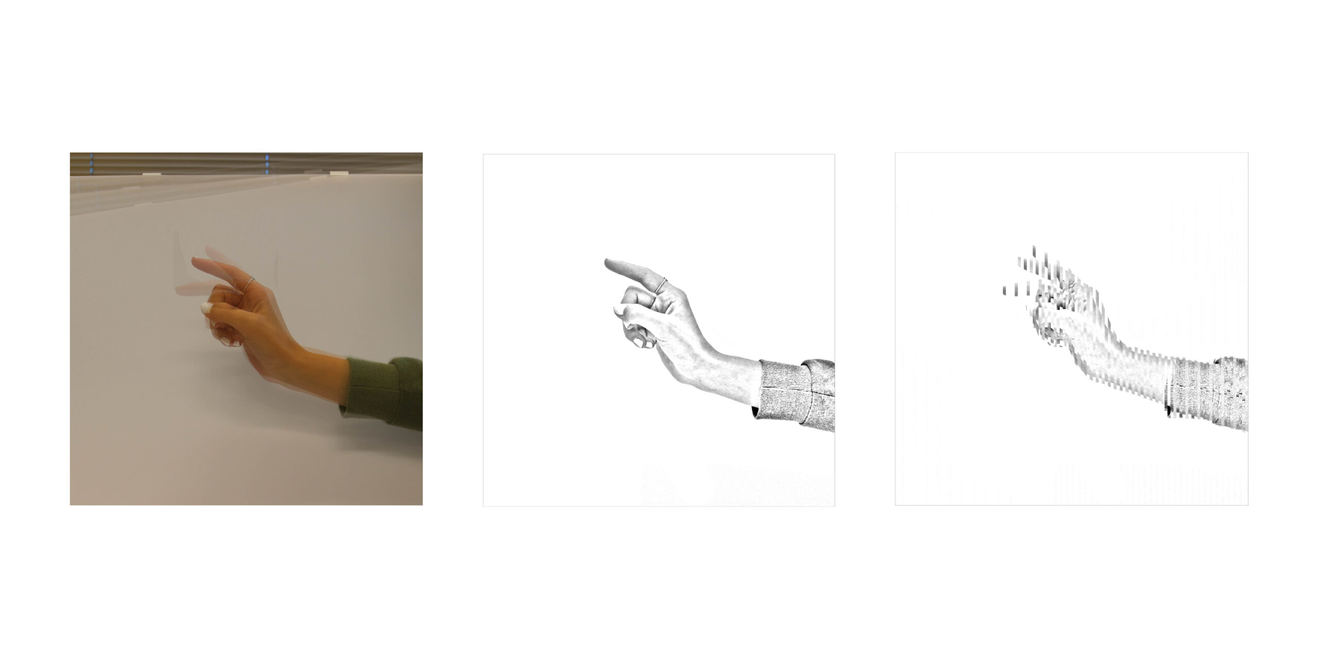
03
An alternative to necessary was necessary. Due to a lack of time, I used a plain photograph of a hand. It points to the sentence: ‘apply now’.
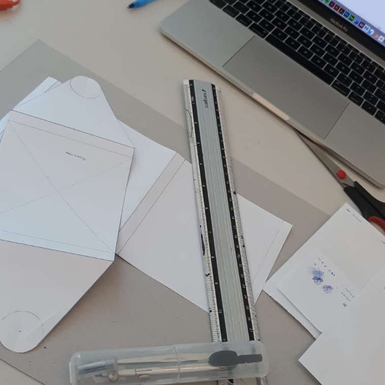
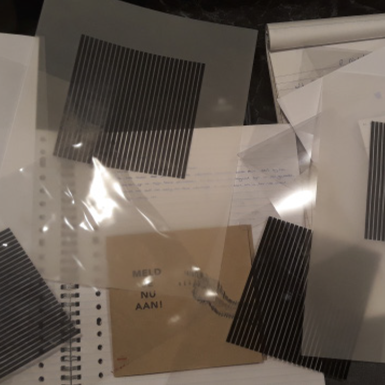
Some photos of the process.
The DaVinci College wants to take little steps towards sustainability. We chose to use recycled paper for this project.